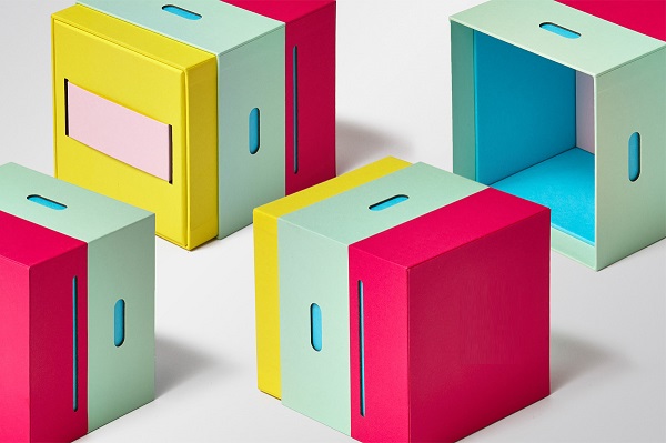
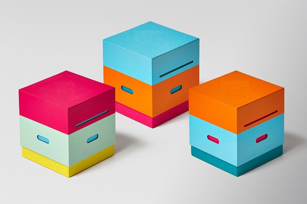
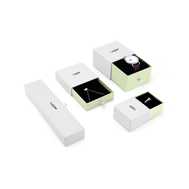
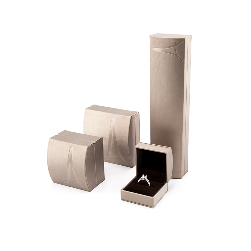
Provide excellent jewelry and
Watch packing solution

 admin
admin  2022-12-20
The design of carton packaging can not be without images but can not be short of words, words are an indispensable element to express ideas, many excellent packaging design attaches great importance to the design of words and even completely use text changes in the processing of decorative patterns. Here to introduce the paper products packaging text design need to pay attention to what aspects:
Content design of package text
Basic text: packaging brand, product name and production enterprise name. Generally arranged on the main display surface, you can also design the name of the manufacturer on the side or back. Generally speaking, the brand name is standardized and helps to establish the image of the product, and the brand name can be embellished.
Product information: the text in the information section includes product composition, capacity, model, specification, etc. The typesetting part is mostly on the side and back of the package. Typography should be used in the design.
Description: describe the use, use, maintenance and precautions of the product. The text should be clear and concise, and the font should be in printed form, which generally does not appear on the front of the package.
Advertising text: mainly used to do the propaganda effect of the text. The content should be honest, concise, vivid, avoid cheating and abetting, and the layout should be diversified. However, advertising text is not a necessary text.
Packaging font design:
Chinese calligraphy font has good performance, reflecting different personality characteristics, is a vivid language in packaging design. Different types of printing have different styles, which have a good impact on the characteristics of different goods. In general, the following points should be noted in the selection of font in packaging design:
The style of the font should reflect the attributes and characteristics of the basic content. In order to avoid being confused by ordinary consumers, it should be adjusted and improved so that it can be accepted by the public without losing artistic taste. Note that the font style of the same name and the same content should be consistent.
24-hour service hotline
Tel: +86 755 25529256
Add: Room 3806, Rongde International Building A, Henggang Street, Longgang District, Shenzhen, China 518115